Sage and Sound is a health and wellness community based in NYC that curates the world’s
best wellness products and vendors. The Study is a virtual and physical space offering seminars,
speaker series from leaders in the industry, and events. My team and I worked to design and
develop a site for Sage and Sound. I focused on designing the blog as well as developing a
pricing strategy for hosting an online video streaming platform on The Study.
In their daily busy lives, people often prioritize other aspects of their lives over
wellness which can result in one becoming out of touch with themselves and their mental and
physical health. Health-conscious individuals in NYC lack a space and community to pursue
their wellness journey and can feel lost exploring different options.
Sage and Sound seeks to streamline one's wellness journey by providing guidance from
experts and curating the products and vendors all under one roof. This increases accessibility
to valuable health and wellness information for people who want to explore these areas.
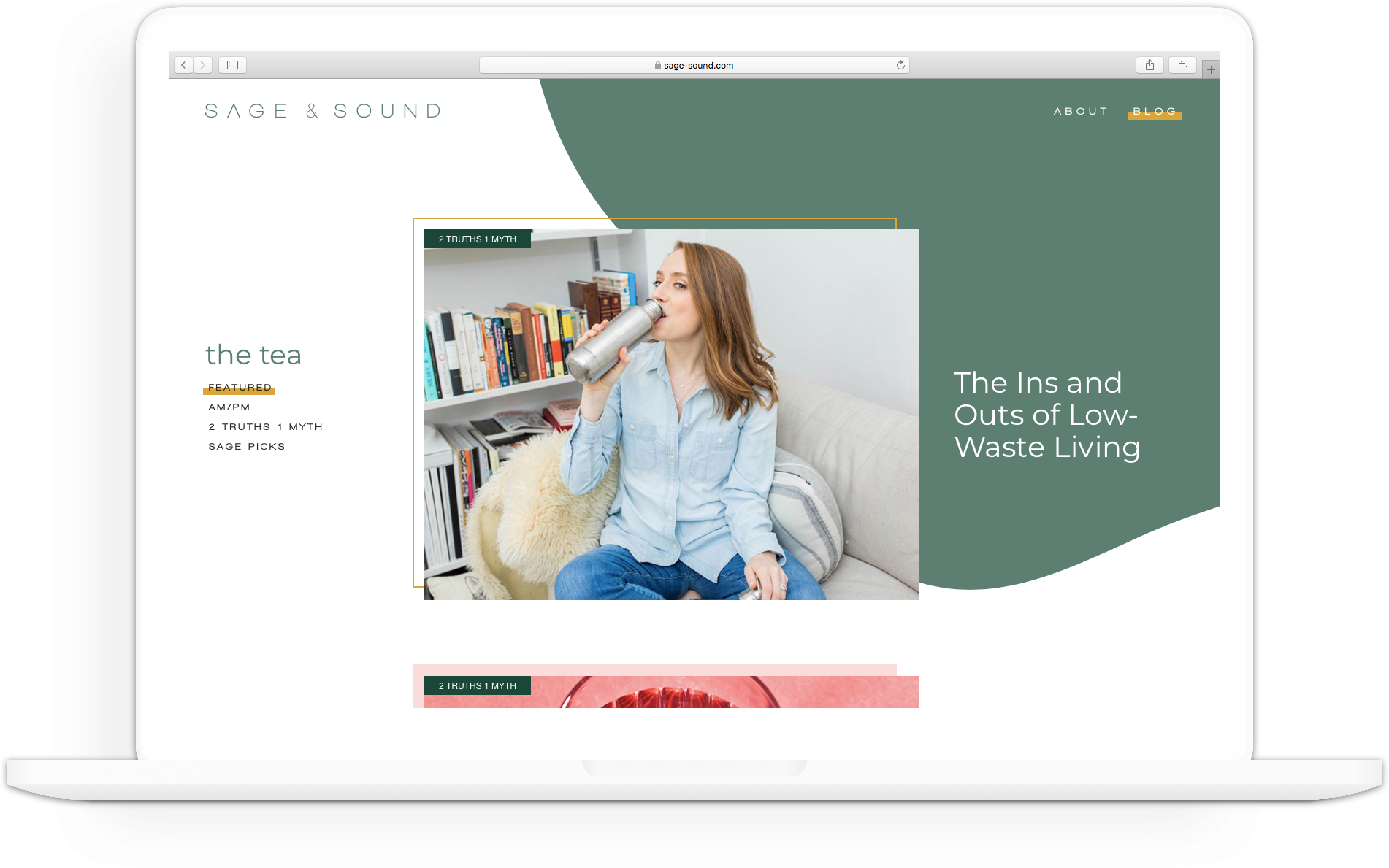
I spearheaded the blog design initiative by ideating different user flows and brainstorming ways
to present information to readers. I came up with several different designs for different pages such as the
Landing Page, Filter Page, News, Events, and Posts. In this process, I first created wireframes
to understand the information architecture of the site. Once my team and I selected which wireframes
we wanted to move forward with, I worked with the visual designer to translate the Sage and Sound design system
and brand onto these wireframes.
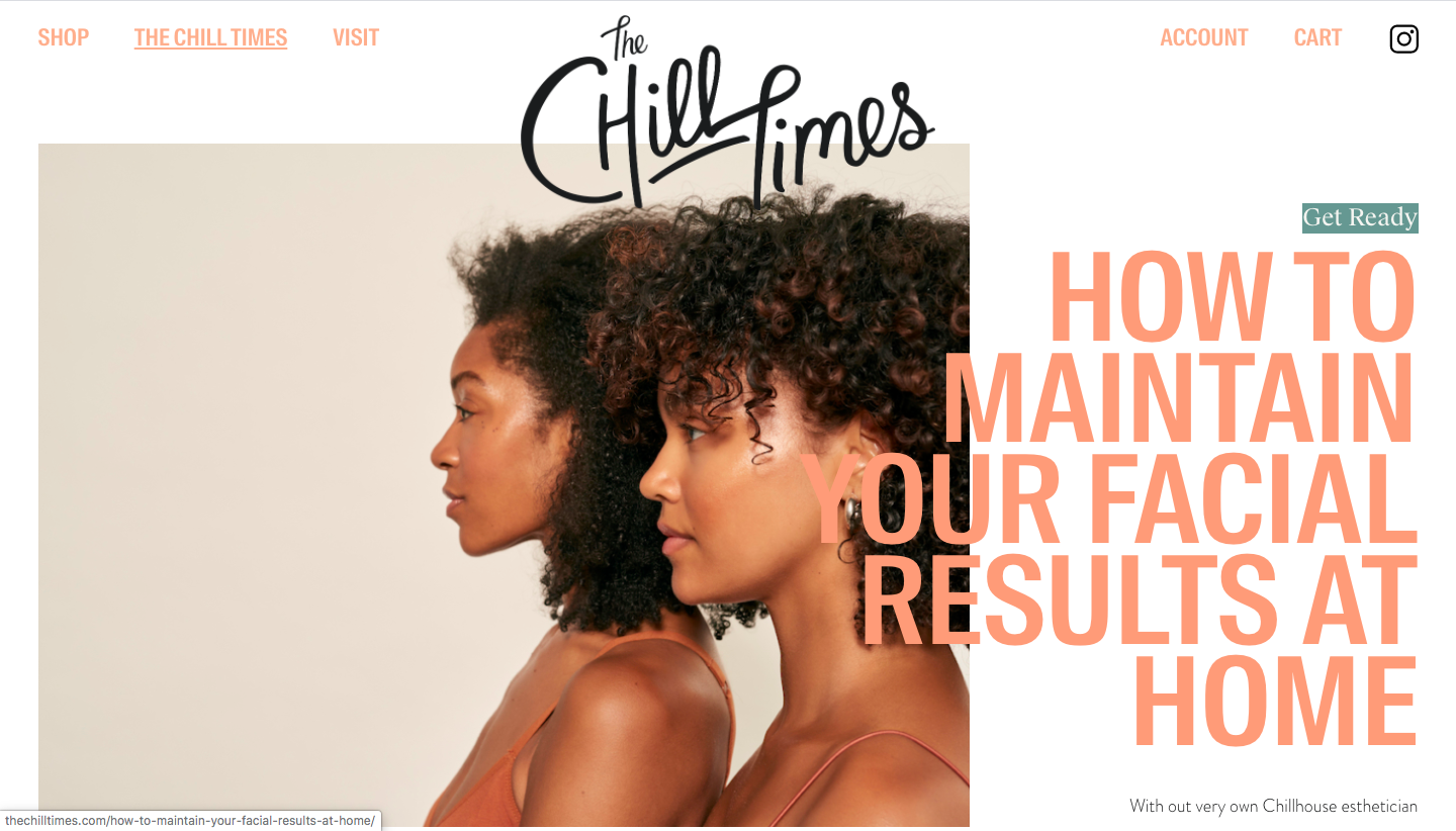
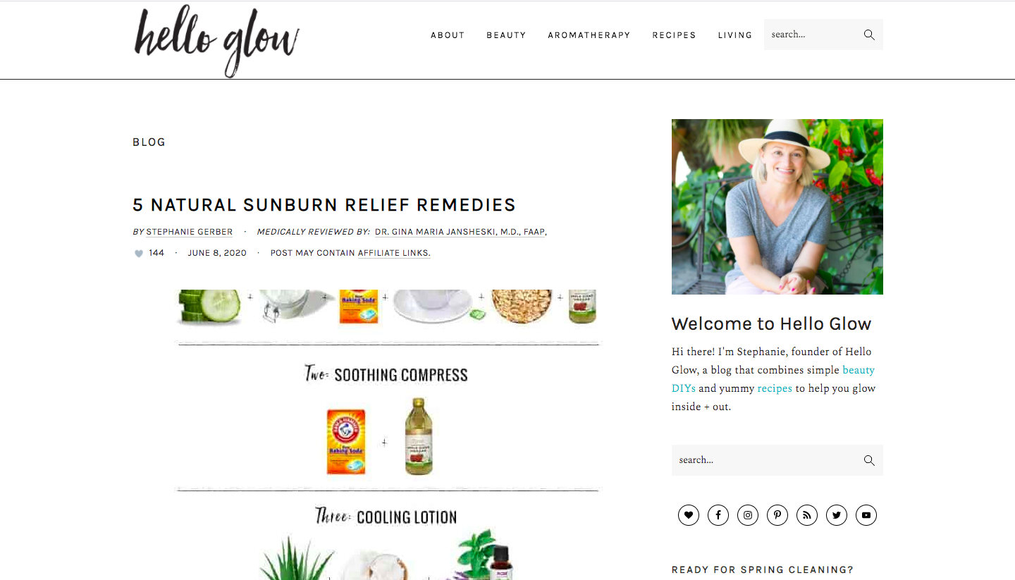
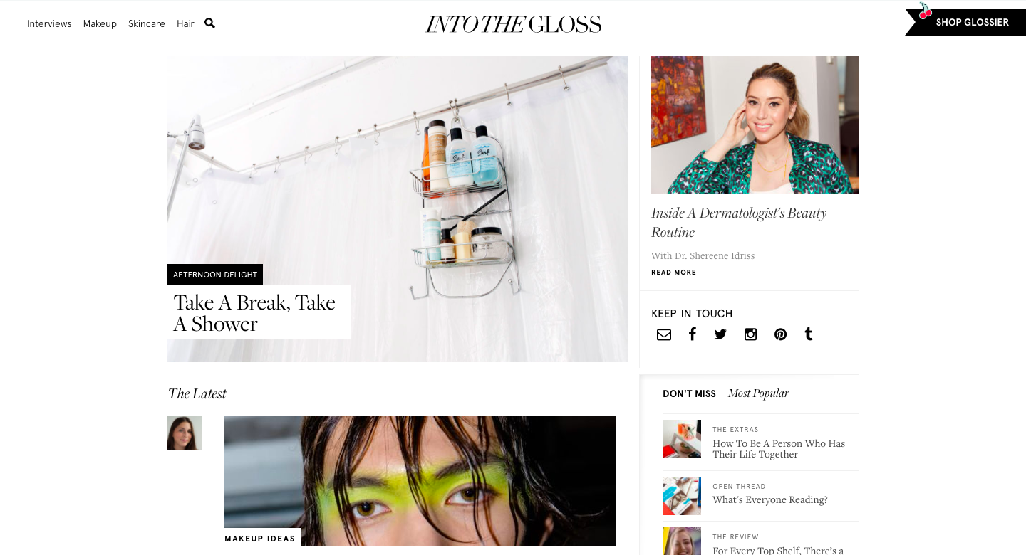
I first researched different health and wellness blogs such as the Chill Times, Babe by Hatch, Into the Gloss,
and Hello Glow for inspiration and to understand the ways in which these successful interfaces are structured.
I found that many sites featured one story and used large images to draw the reader's attention.
I was particularly inspired by the scrolling design of the Babe by Hatch blog.
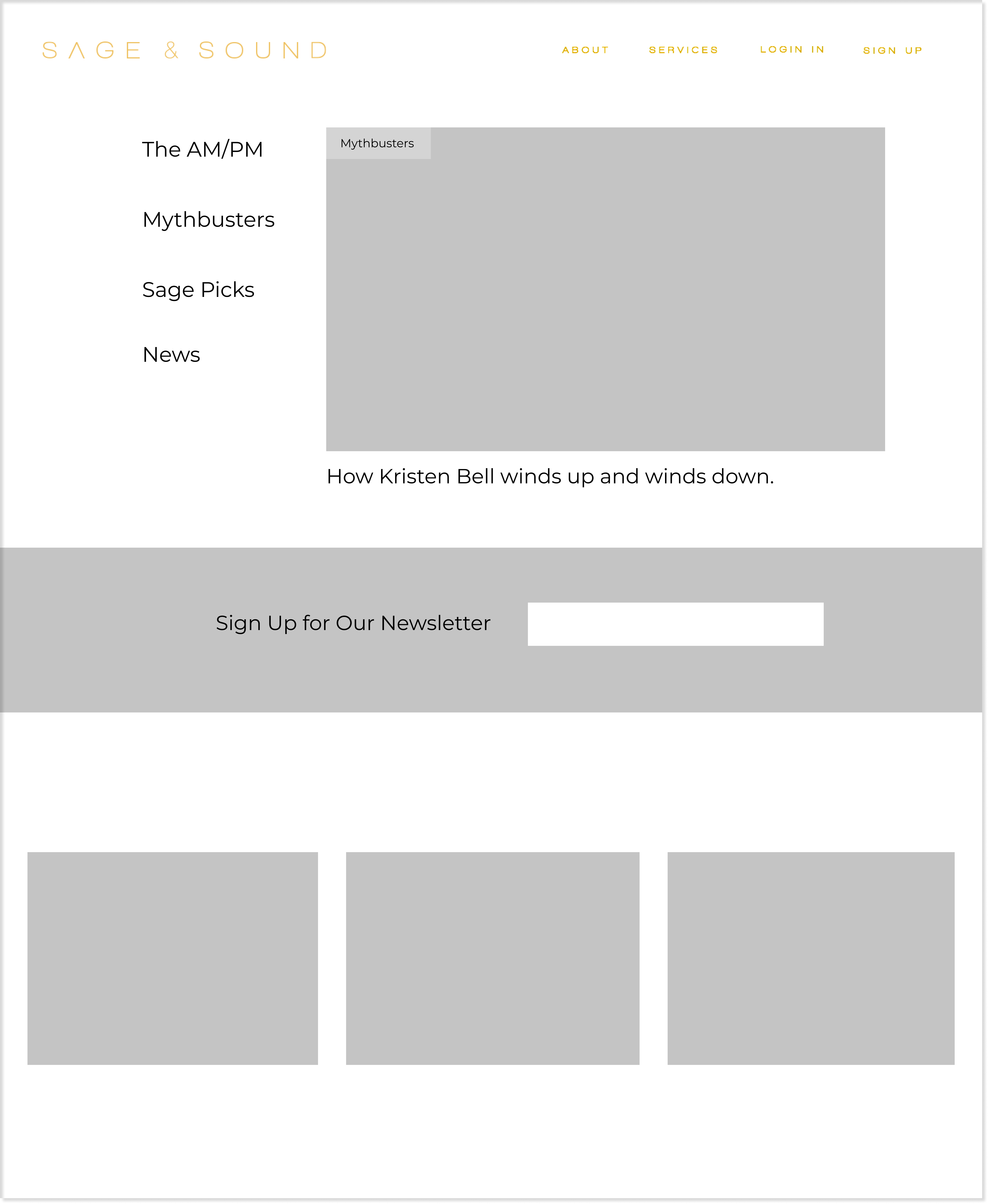
One challenge that I had to overcome while designing the wireframes for the landing page was
figuring out a way to categorize content. The copywriter created four different categories of
content which I considered separating into different pages which could be accessed by a dropdown subnavigation bar on the home page (Option 1) or
placing this secondary navigation bar on the blog page (Option 2). Because I wanted the user to explore all four
categories, I decided that a central landing page called Featured with a secondary nav bar would
increase engagement as this page would display popular articles from each category.
However, a second horizontal nav bar directly below the first could be overwhelming for users. As a result, I
decided on placing a vertical nav bar on the left hand side next to a featured article to ensure its
prominence without being too overbearing.
Option 1
Option 2
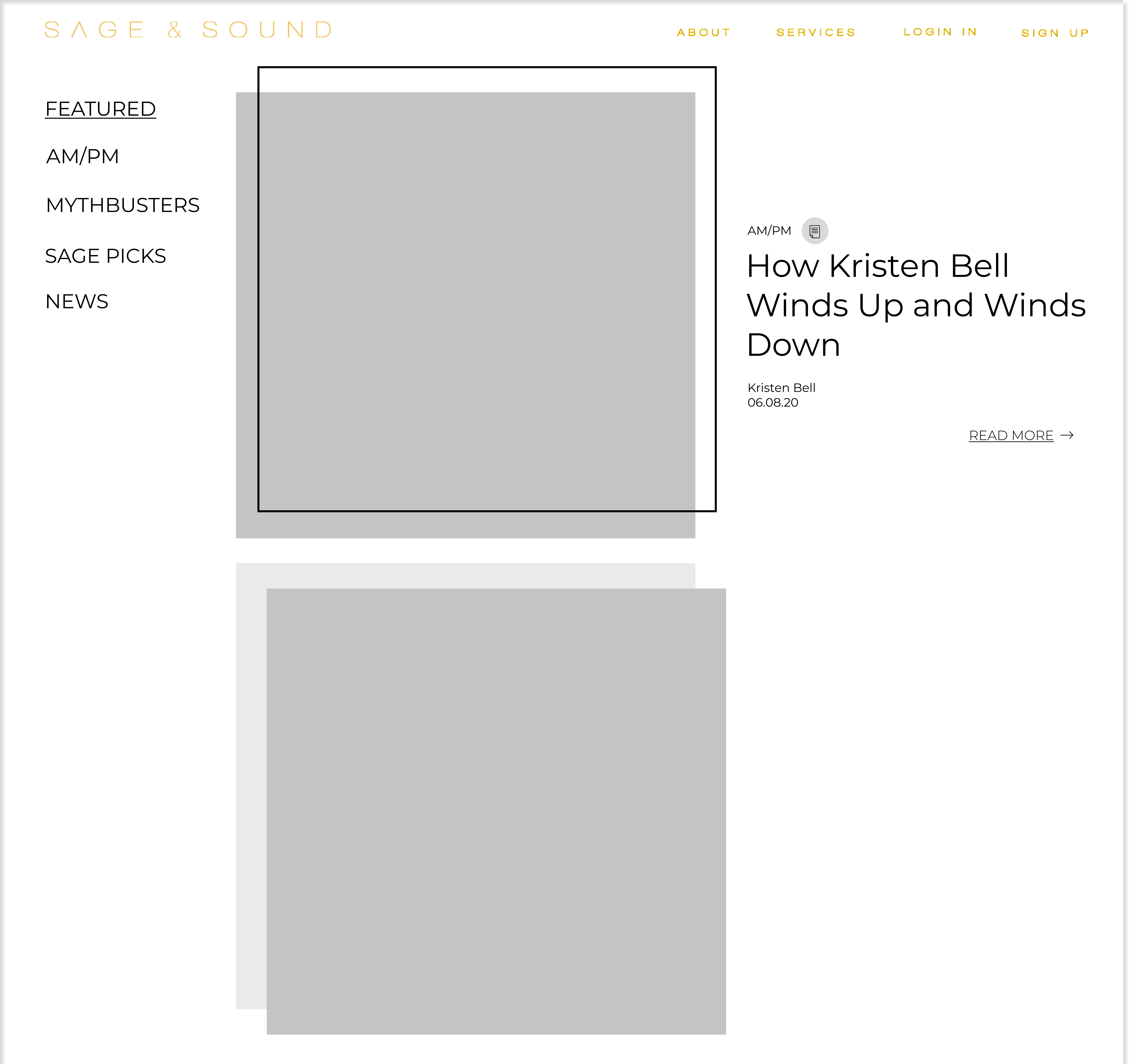
Another big decision that I had to make was how much content would be presented to the reader.
After much deliberation, I decided that one large story would be presented to the viewer
upon entering the site and as they scrolled down, the text would transition into the next article
in the final wireframe design. I was mainly inspired by Babe by Hatch website design. One reason why I made this decision was due to the nature and size of
the platform. Because Sage and Sound is new, we didn't have too much content for the site at that time so
it made sense to spread the content out instead of presenting everything on one page.
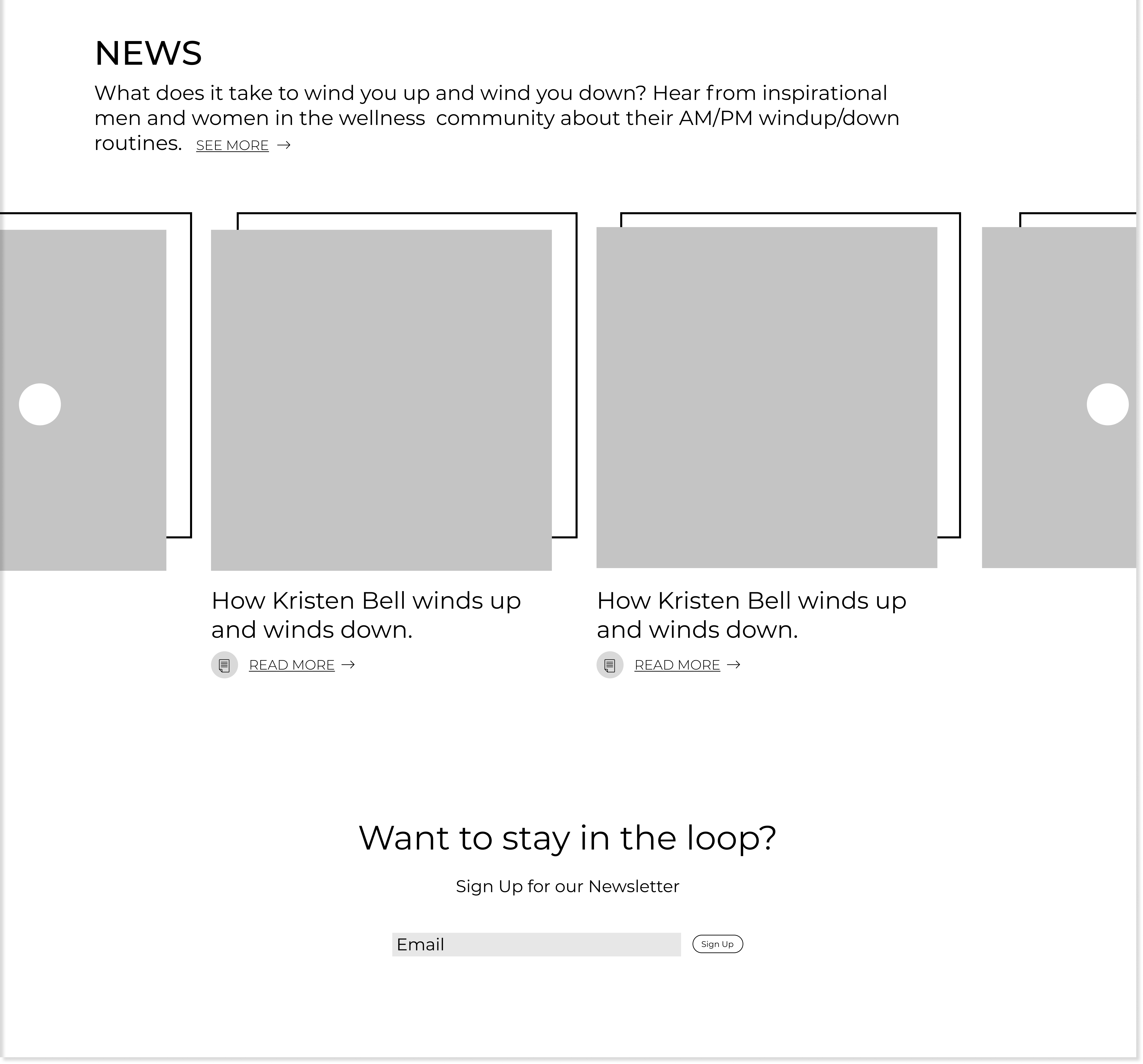
After a user scrolls through all of the featured articles, he/she is introduced
to the four categories of content and can browse through available articles in that category on the featured
page or visit the category page. Through several iterations, I decided on presenting each category in a horizontal row carousel.
By presenting a few articles for each category on the featured page, the user is exposed to all of the categories before choosing which one he/she is most interested in.
I also had to consider how much information should be presented on each article such as title, type
of content, author, date, etc. I decided to go with less information, only including the title and article
type to maintain the viewer's focus. Finally, I had to consider the placement and number of
email newsletter sign up boxes. Instead of having a pop-up box which could be potentially jarring
and lack context, I decided on placing one after the user has been introduced to the content of the
blog as well as one in the footer of the page.
After presenting the wireframes to our client and gaining their approval, we proceeded to
move forward with integrating the visual designs before the website was coded and launched.
Slight changes and additions have been made since these designs were created.
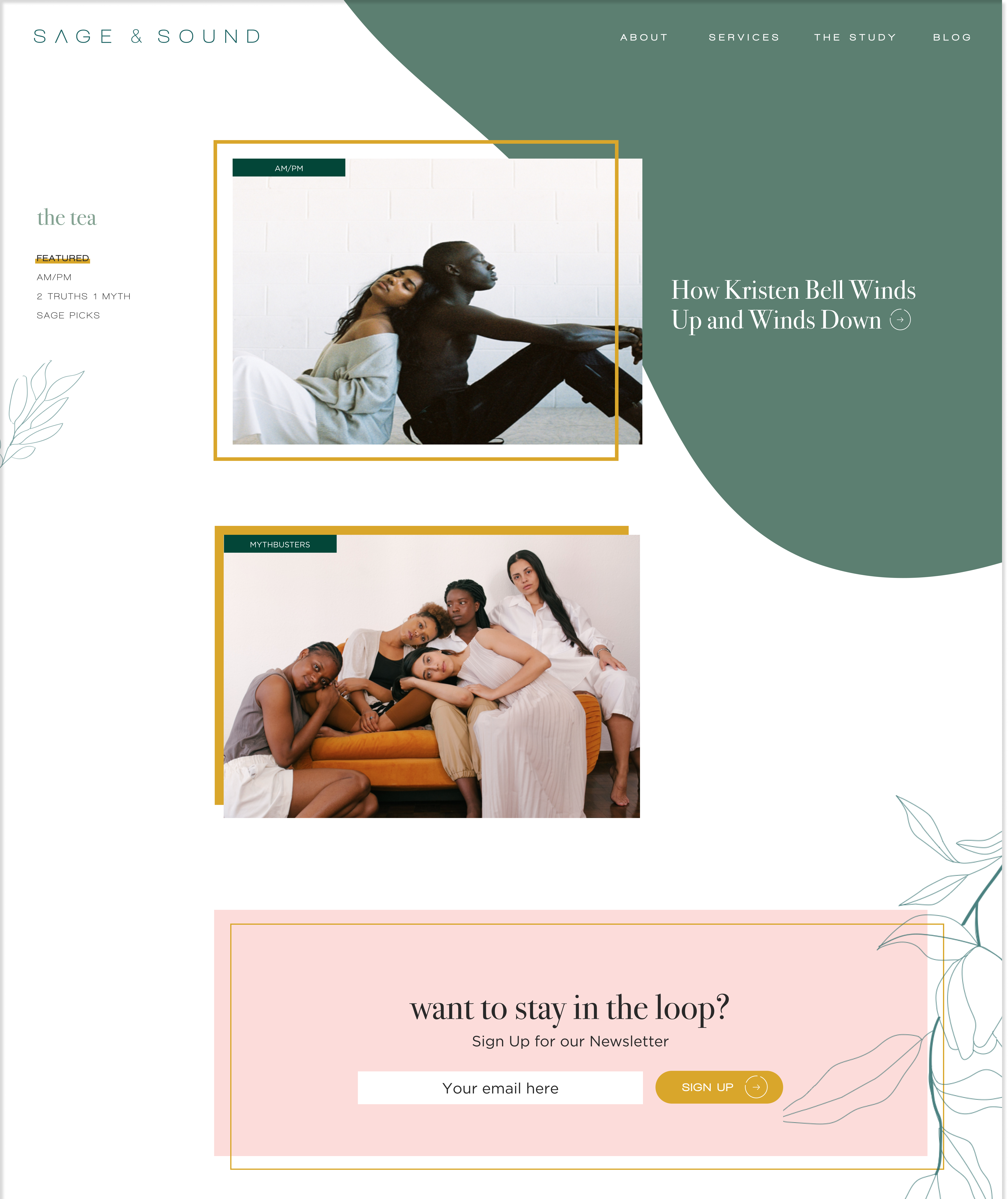
The visual designer and I incorporated key elements from the design system
such as the color palette, font system, large blobs, images, and thin sage renderings.
For each content category, we created a landing page with information about the category
and articles. This page can be accessed by either the side navigation bar on the homepage
or the horizontal carousel. While designing the wireframes for this page, I had to consider
how many articles the viewer should be presented with and how much information about
the article would be presented.
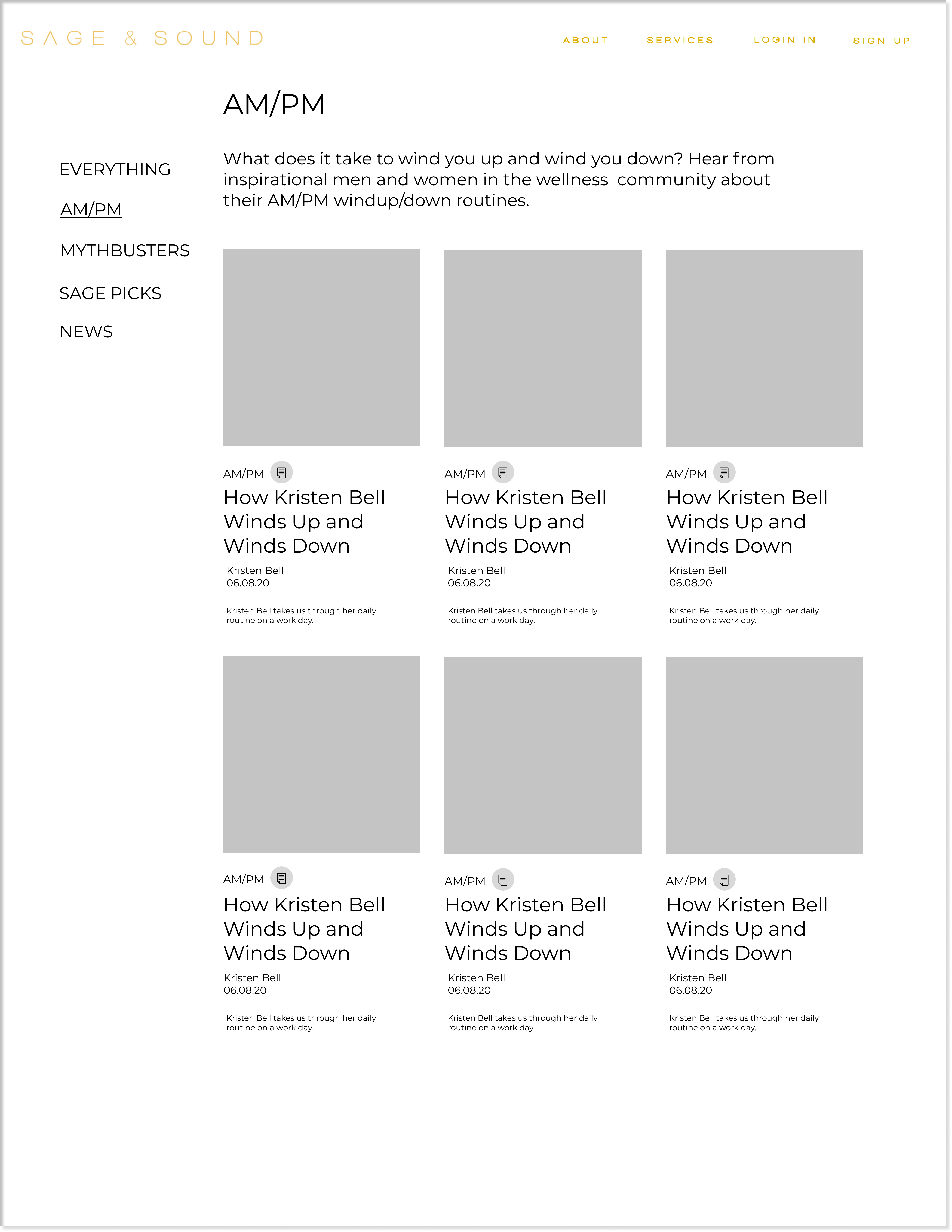
In the final designs, my team and I decided on rows with two articles because of the
amount of content available on the site. We also decided to limit the amount of information
available to the viewer to just the title and a quick article preview.
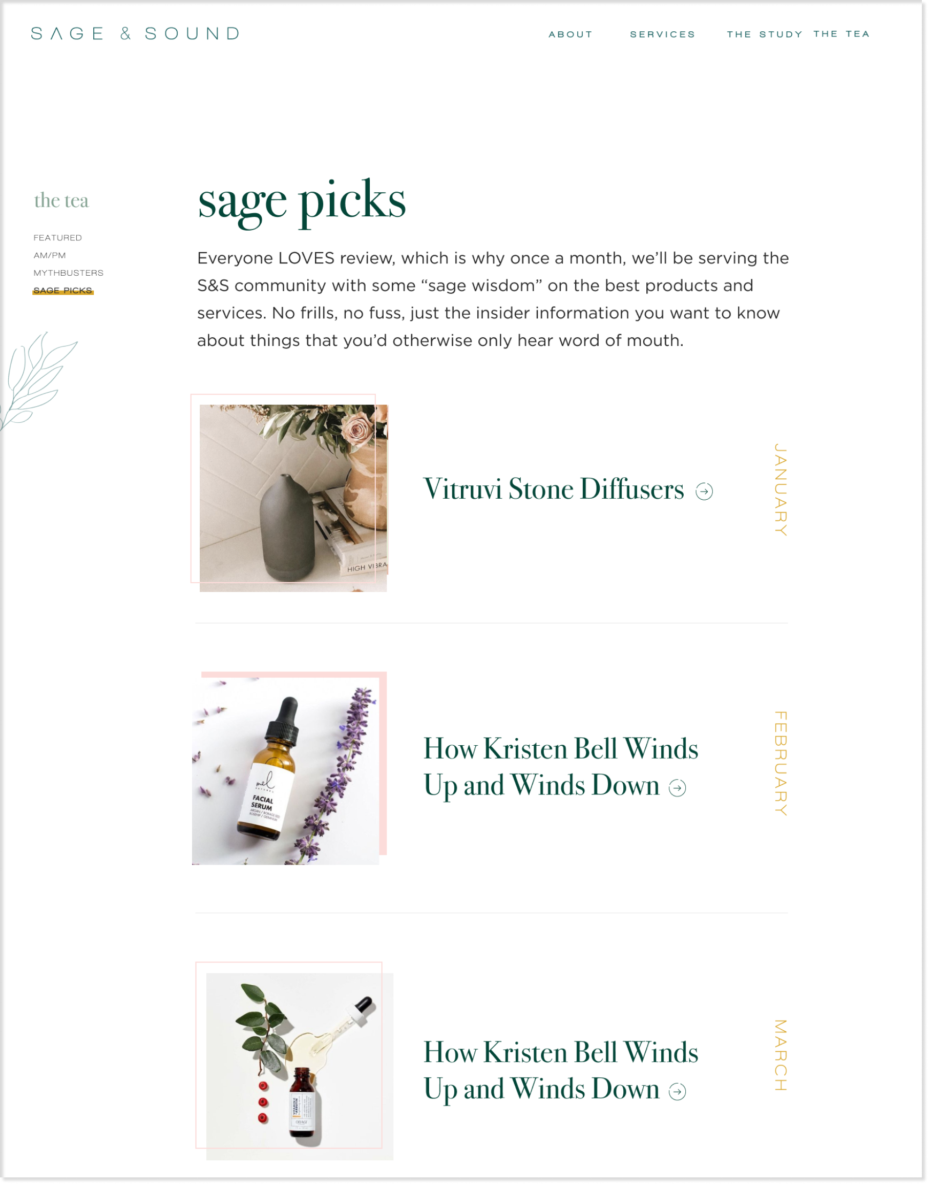
In addition, certain pages required a different design tailored to the content on the page.
For example, Sage Picks are monthly recommendation articles. I felt that including the month
of the article was essential to the information architecture of the page while a preview of
the article was less important. As a result, the following design was developed.
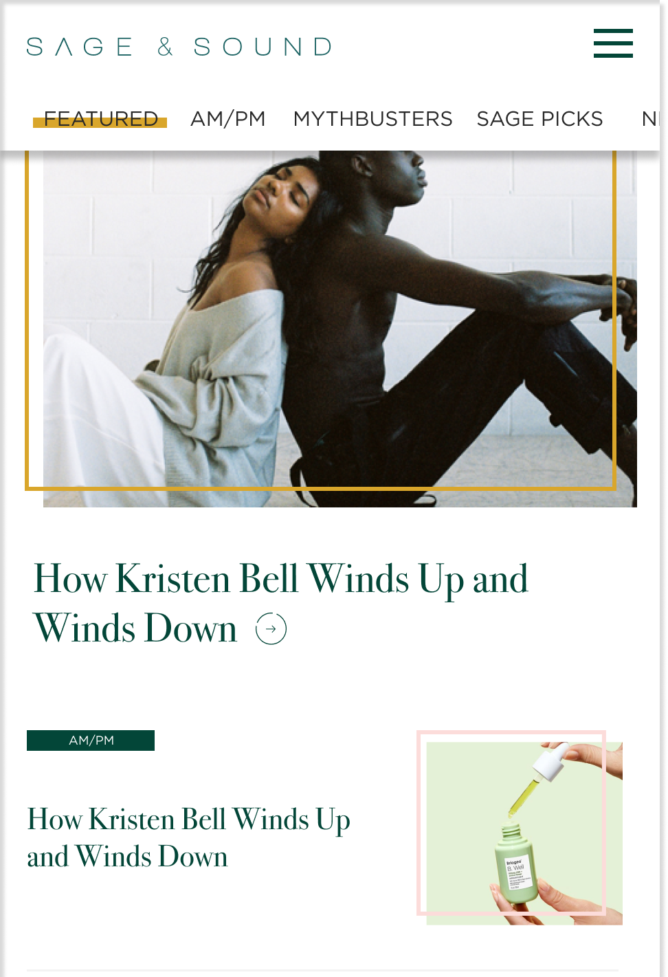
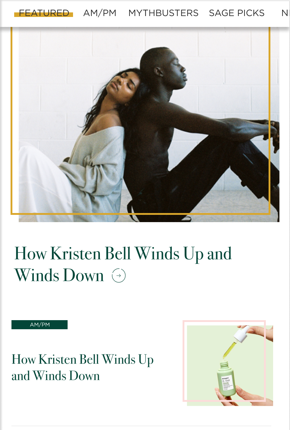
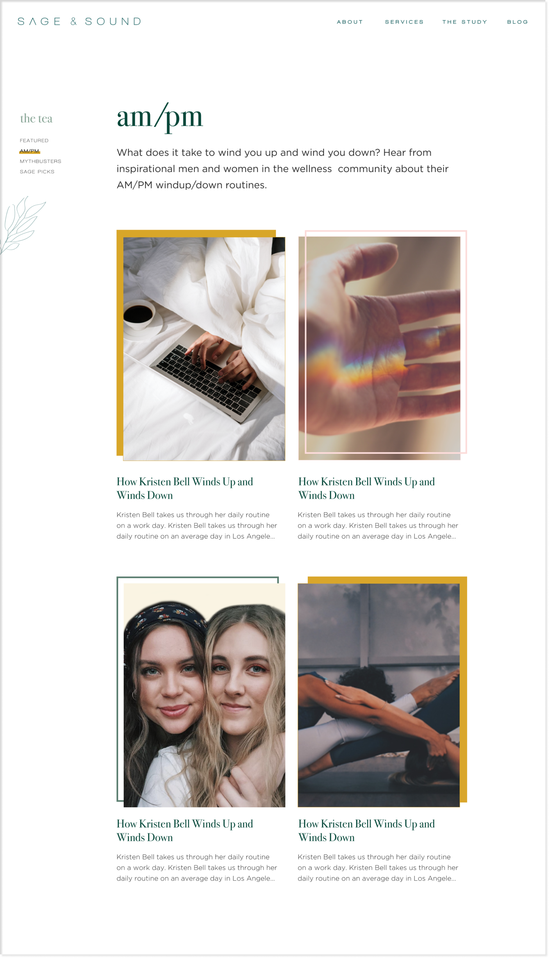
My team and I designed different post pages depending on the type of content on the page.
For the article page, we had to consider the placement of the title and images, block quotes, headers,
and bullets. Each post concludes with a horizontal carousel of suggested posts at the bottom of the
page to encourage users to explore other articles that may be of interest to them.
In the final article design, my team and I iterated on the size and placement of
the image and incorporated larger text to summarize the article. We ultimately decided
on center-aligning the text to increase readability and integrated the brand colors
and fonts.
In addition to the plain text article, my team and I explored different information
architecture for video and podcast content. For the video page, we had to take different
states into account such as paused and playing as well as consider
which additional information was essential to include.
In designing the podcast page, we had to decide how we wanted to include images.
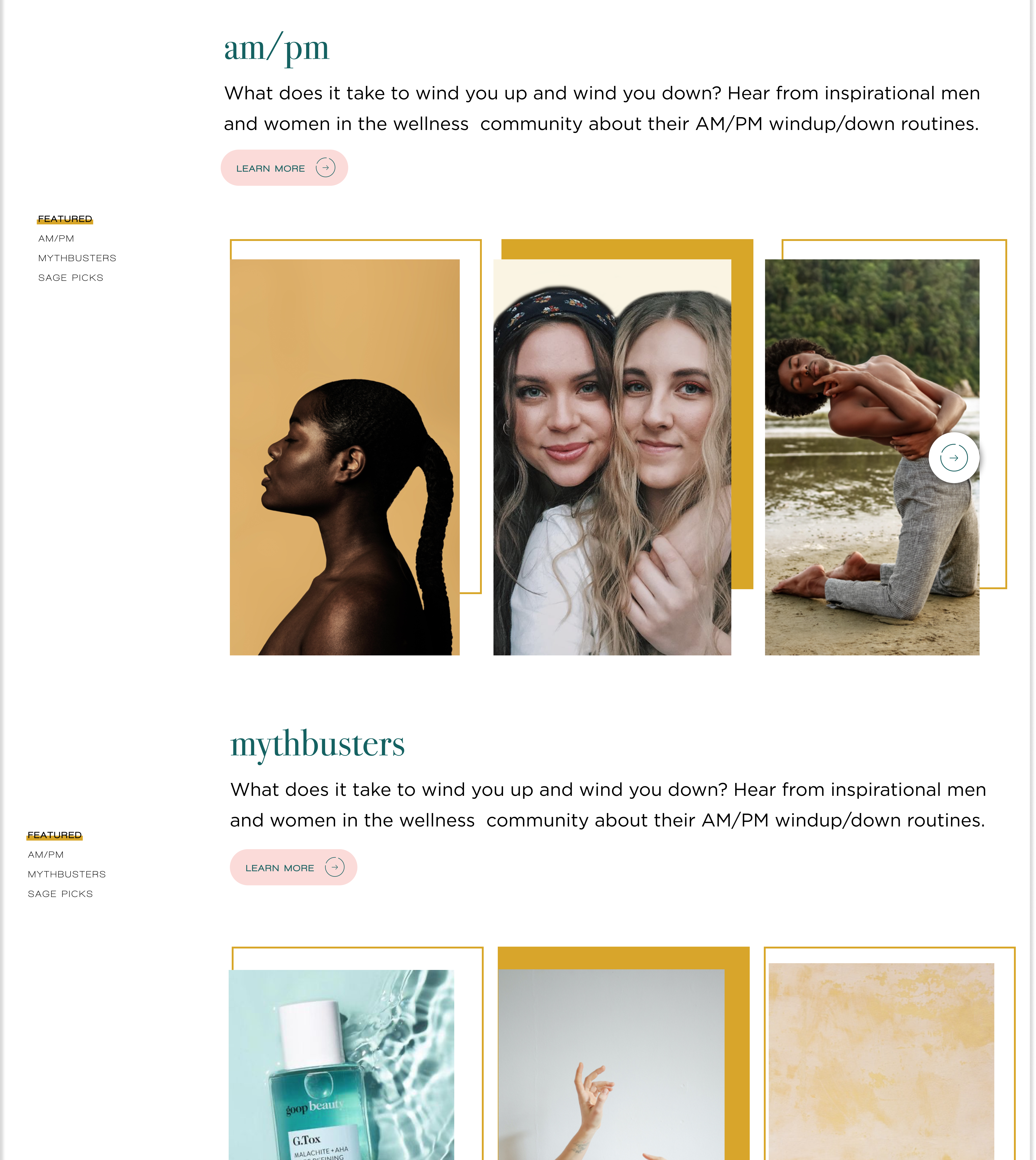
Finally, different categories of content could have tailored designs to the text in the article.
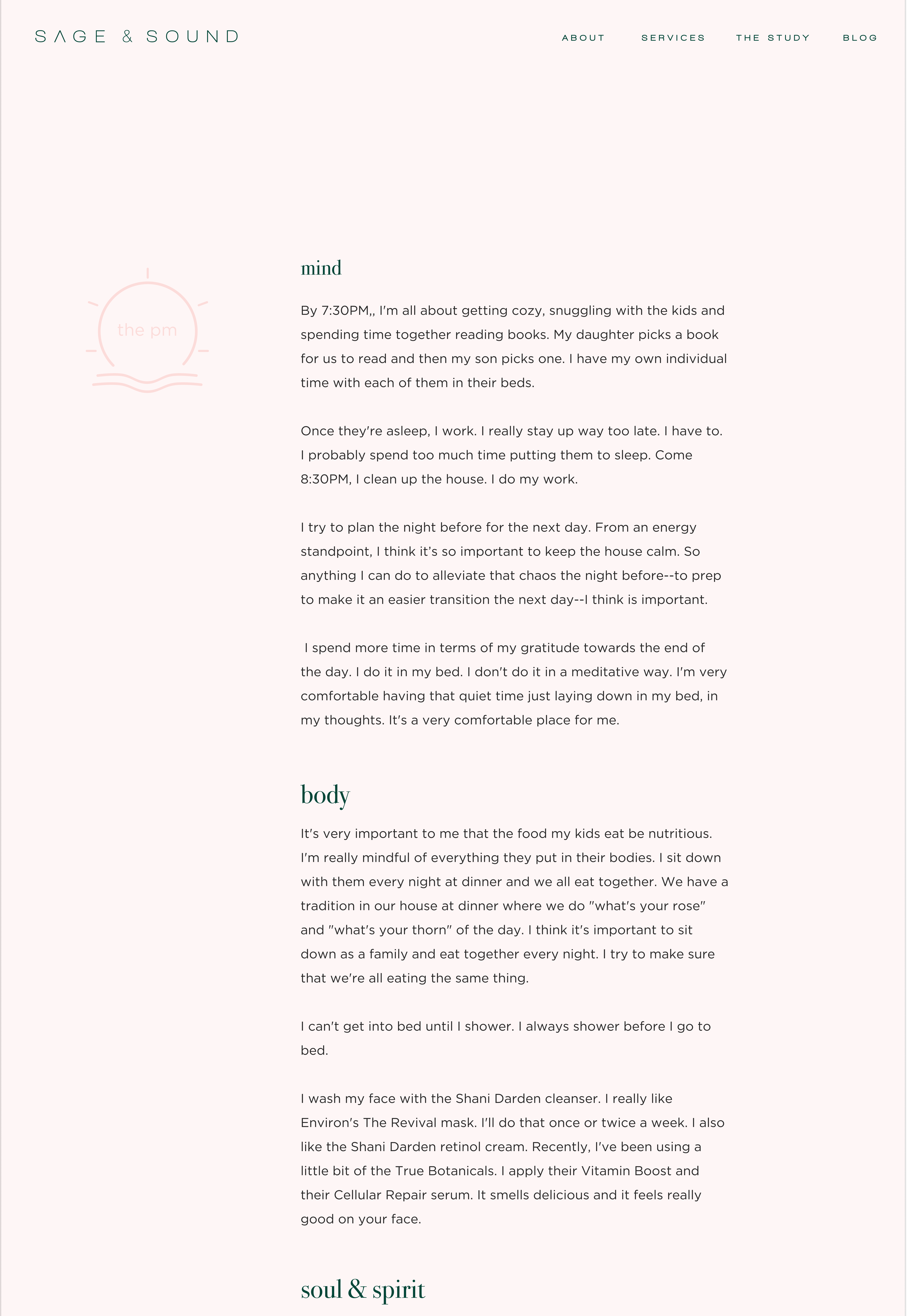
For example, the AM/PM category goes through the daily routine of a wellness expert, listing
products and routines they employ throughout their day. Because the content is divided into two distinct
sections - AM and PM - we decided to tailor the designs to visually represent this.
The orange color in the background of AM represents the sun rising in the morning while the
light pink color in the background of PM represents the sun setting in the evening. Within
these two categories, the content is broken down into three more categories: mind, body, and soul.
We experimented with labeling these categories vertically and horizontally and ultimately decided on
horizontal labels above the text. As the user scrolls down, the background color changes
once the user finishes reading the AM section.
After reading the article, the user may be interested in purchasing the items that
were mentioned in the article. To make this easier for them, I designed a Shopping List
at the bottom of the article. The list clearly breaks up the AM and PM sections and links
the products in an orderly fashion. While working on these designs, I had to consider
how I would label the mind, body, and soul sections.
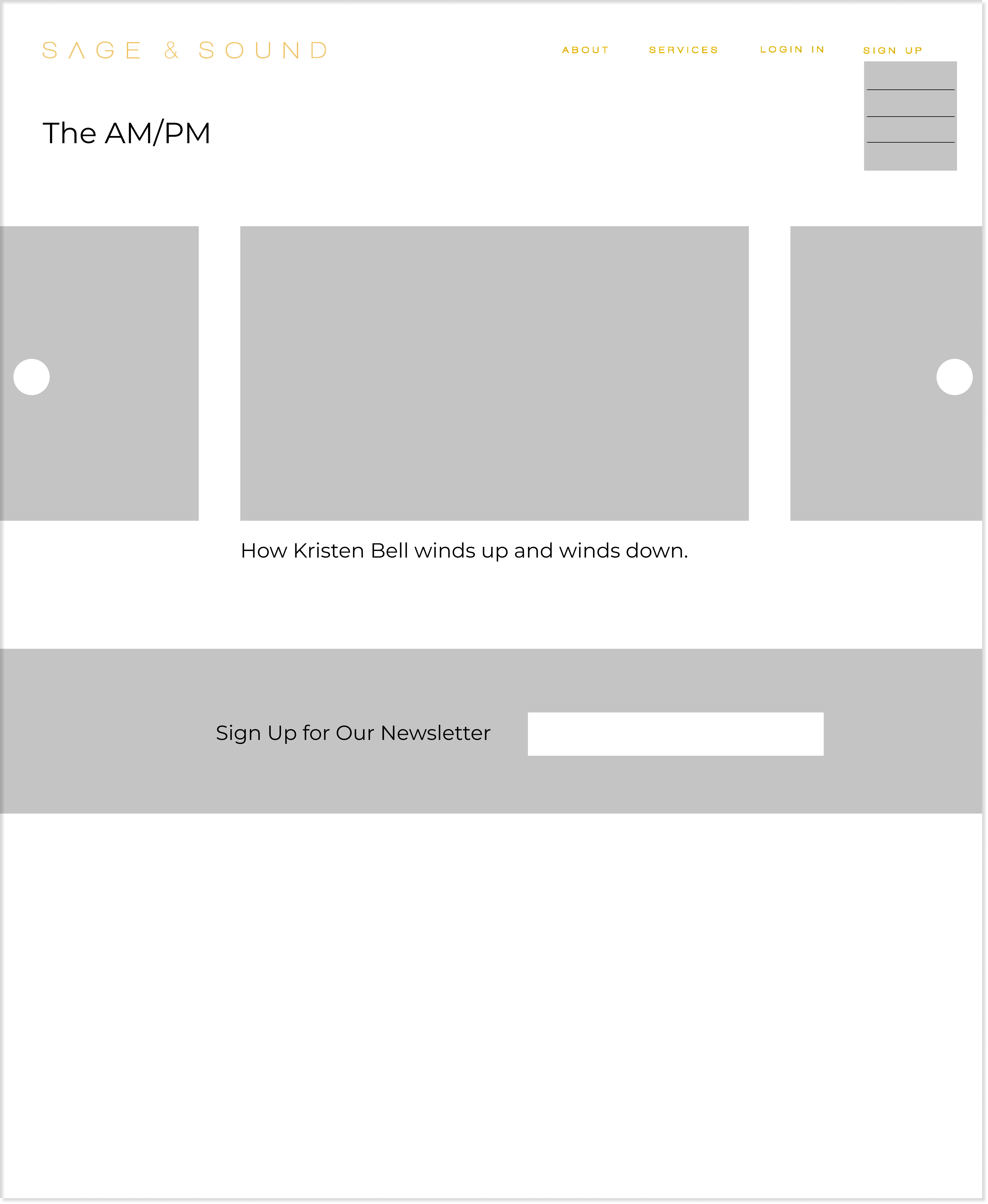
In addition to creating wireframes and final designs for the desktop version of the site,
my team and I designed mobile versions. One challenge I faced while working on these
designs was how to implement the secondary navigation bar. From my inspiration, I decided
that a hamburger menu for the primary navigation bar would allow for room for a horizontal
secondary navigation bar across the top of the page. I also reconsidered how much information
I would provide about the articles on the landing page as a phone screen is much smaller.
The Study offers resources for those who want to learn more about their health and wellness
through classes and community discussions. Because of the pandemic, Sage and Sound had to delay
their in-person opening. As a result, we worked to create a virtual study with classes online.
One question we asked ourselves was: How
could we create a sense of community online?
In order to facilitate a sense of community during online classes, we need to build out
an interactive video platform by using several services. From a strategic perspective, I had
to think about how we could minimize our costs while finding an effective video infrastructure.
We decided to go with Mux to build live videos but had to approximate costs based on factors such
as video duration, videos/month, monthly view count, and watch time to find total costs.
In addition, we needed to employ a server, streaming software, and chat service. We used
the following equation to calculate total costs:
Total Cost = Mux + Netlify Server + Streaming Software + Chat Service
I created a spreadsheet to figure out how we could optimize our costs on Mux, while taking our needs into consideration.
From this spreadsheet, I was able to find the lowest and highest possible total cost/stream. This information was used to make decisions regarding
the streaming software and chat service selected as well as a plan on Mux.
I really enjoyed this project as someone who is passionate about health and wellness myself.
Taking ownership of the blog designs allowed me to strengthen my skills in wireframing. I thought
that working on the layout of the blog was a unique experience and looking at other blogs
for inspiration was essential. I also found working on the pricing strategy of the livestreaming
platform and learning about how video livestreaming works to be a really valuable experience. On this project, I had the opportunity to participate in meetings
with the client and offer my feedback and opinion which was exciting and I can't wait to see how
this brand takes off in person.
This website was created by Chloe Kanders, Copyright 2020.