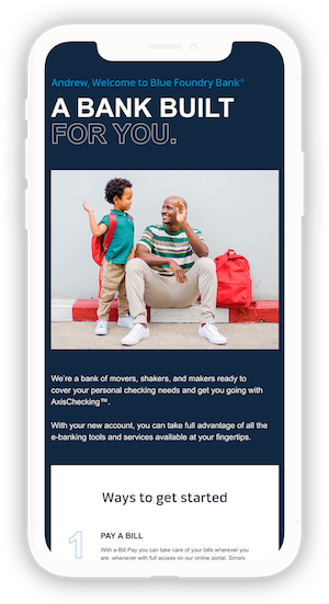
I worked to design onboarding email templates for Blue Foundry Bank, a regional bank based in New Jersey.
In this process, I conducted market research to understand the customers and their needs, created a customer journey map and iterated on template designs for two different products.
My team and I developed templates for the AxisChecking account (personal) as well as Blue Carbon Banking (business).
Blue Foundry Bank is a regional bank targeting "movers and shakers," offering personal banking and business banking plans.
Local banks, community banks with less than $10 billion in assets, often have smaller fees, support local economies, giving back to the community, yet
have a small lending capacity. On the other hand, larger banks such as regional and national banks have locations in many cities, attract people who want debit reward cards,
and move currency between countries faster. However, with rigid processes, these banks can be harder to contact.
Consumers who are attracted to regional banks aren’t interested in any specific account features (ex. mobile check deposit, mobile banking)
and are more interested in looking for surcharge-free ATM.
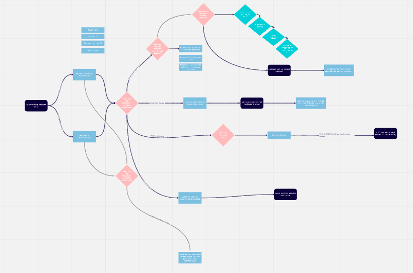
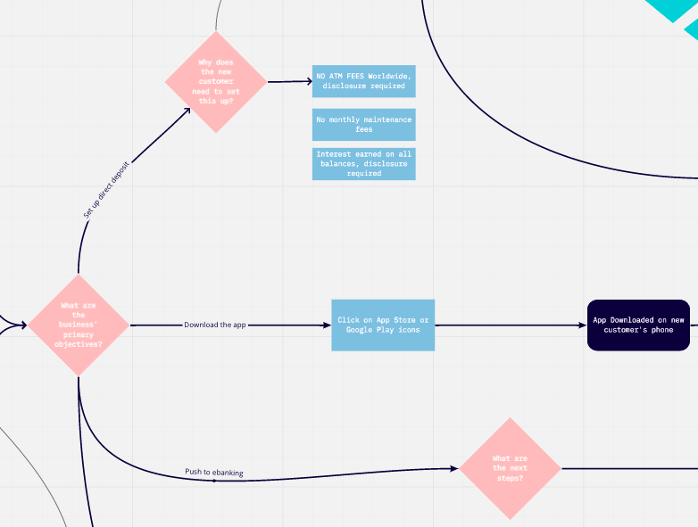
In order to map out the user interactions and flow of the emails with the information provided by Blue Foundry Bank,
I created a customer journey map.
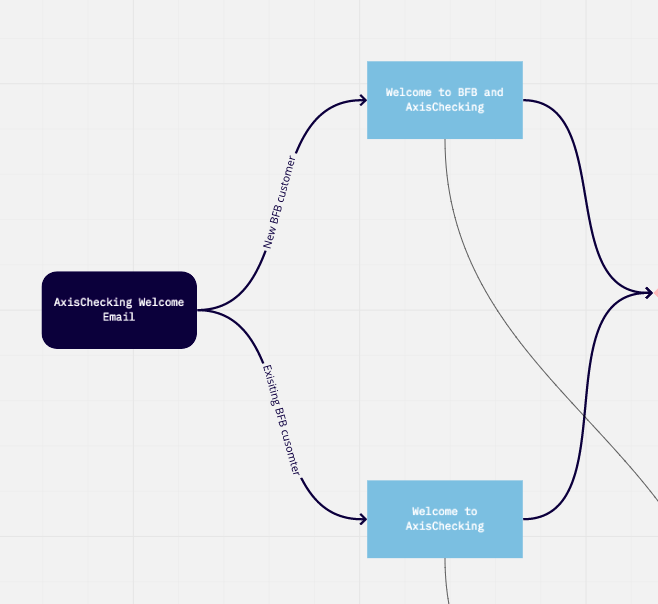
Our emails were sent to two types of customers: new customers and existing customers.
As such, we had to tailor the content in the email to the needs of each group.
New customers needed to be welcomed to both Blue Foundry Bank and AxisChecking while existing
customers only needed to be welcomed to AxisChecking.
From here, I broke down the content by the business' primary objectives and secondary objectives.
The primary objectives are for the customer to set up direct deposit and electronic bill pay, as well as download the app.
For each objective, I mapped out all of the necessary steps and information for the user to complete the goal.
I took this hierarchy of information into account when designing the email templates.
While designing the email templates, I first looked to other onboarding email designs for
inspiration. I noticed that other companies used a large central graphic to capture the
viewer's attention with a welcome message. For the onboarding process, the steps are listed out
in a column and many include a graphic with each step. I kept this inspiration in mind when I
designed the email templates.
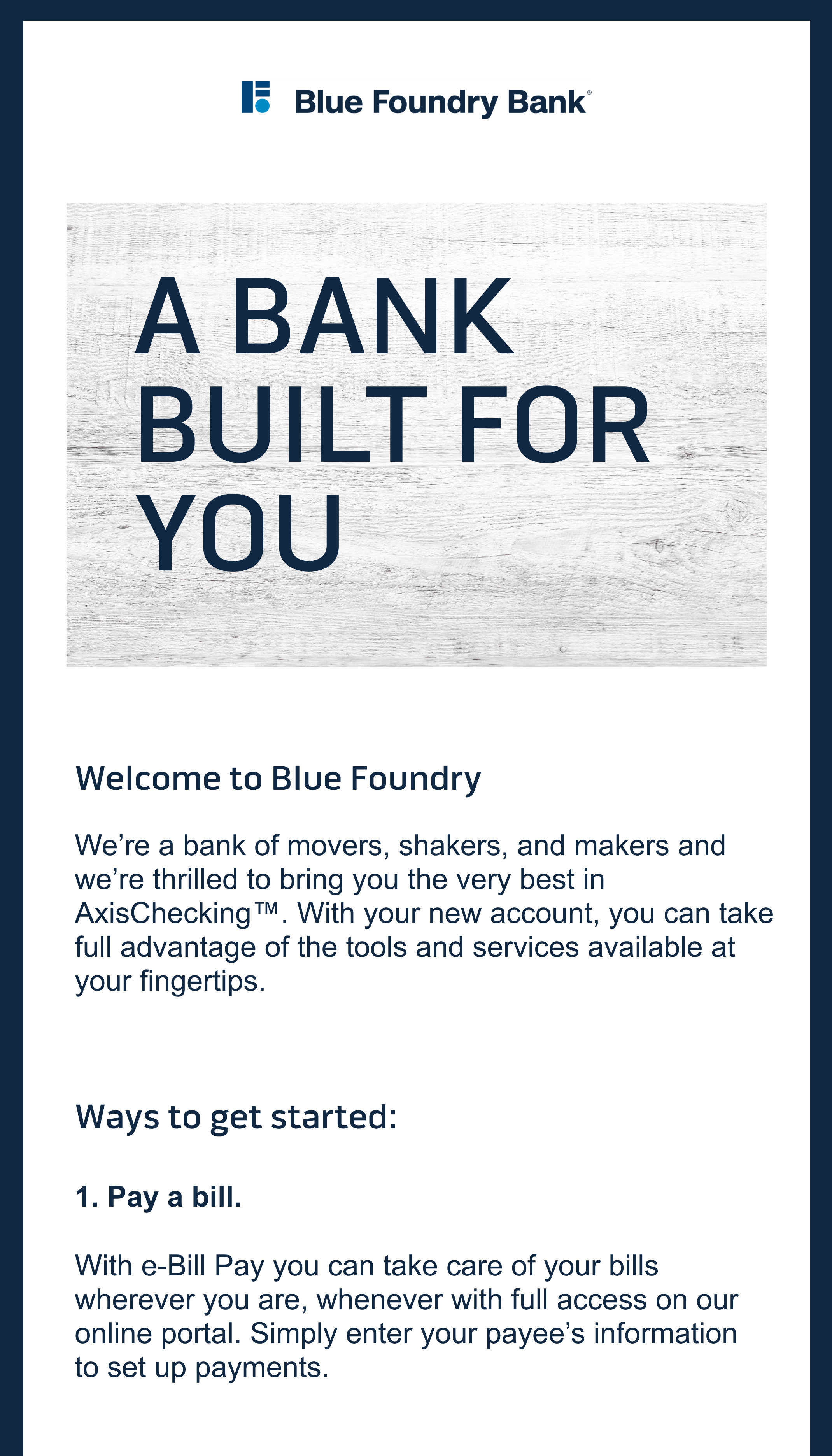
Due to the timeline of the project, my team and I skipped the wireframing stage and jumped right
into designing with the brand system in mind. I initially explored different design variations integrating the
brand colors and assets. I realized that in order to engage the user, the email should have large graphic
or image at the top and include the customer's name in the heading. I also experimented with ways
to make the onboarding checklist more inviting by varying the size and colors of numbers and text.
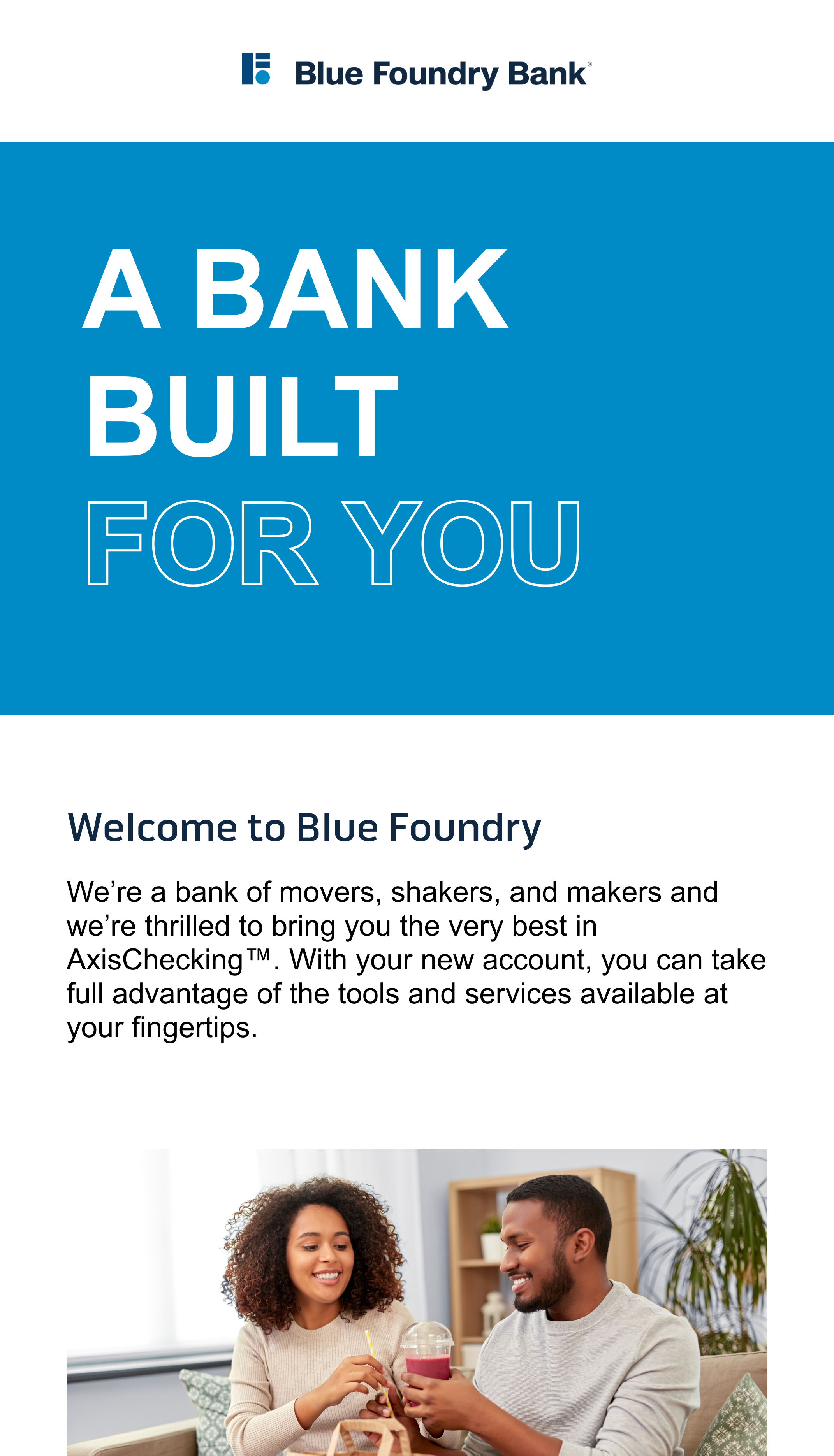
While my team and I liked the phone graphic in the third email, we decided to go with a stock image
instead to make the template easily replicatable.
In designing the email series flow, my team and I had certain goals in mind. Our key objectives were
keeping the emails on-brand with differentiation, creating resuable components, and ensuring
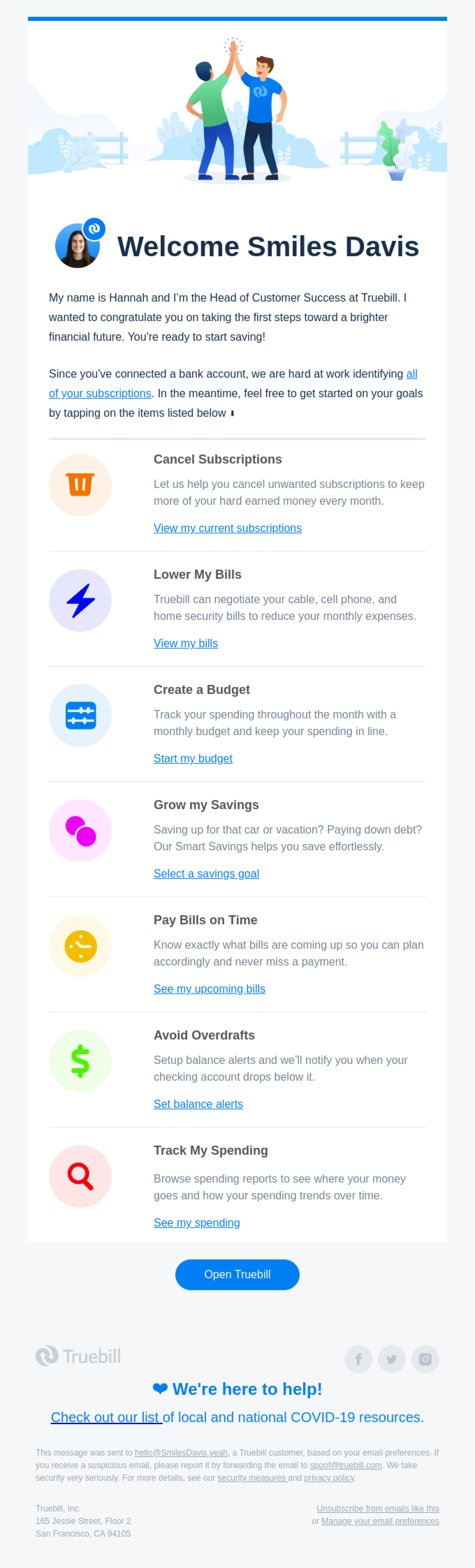
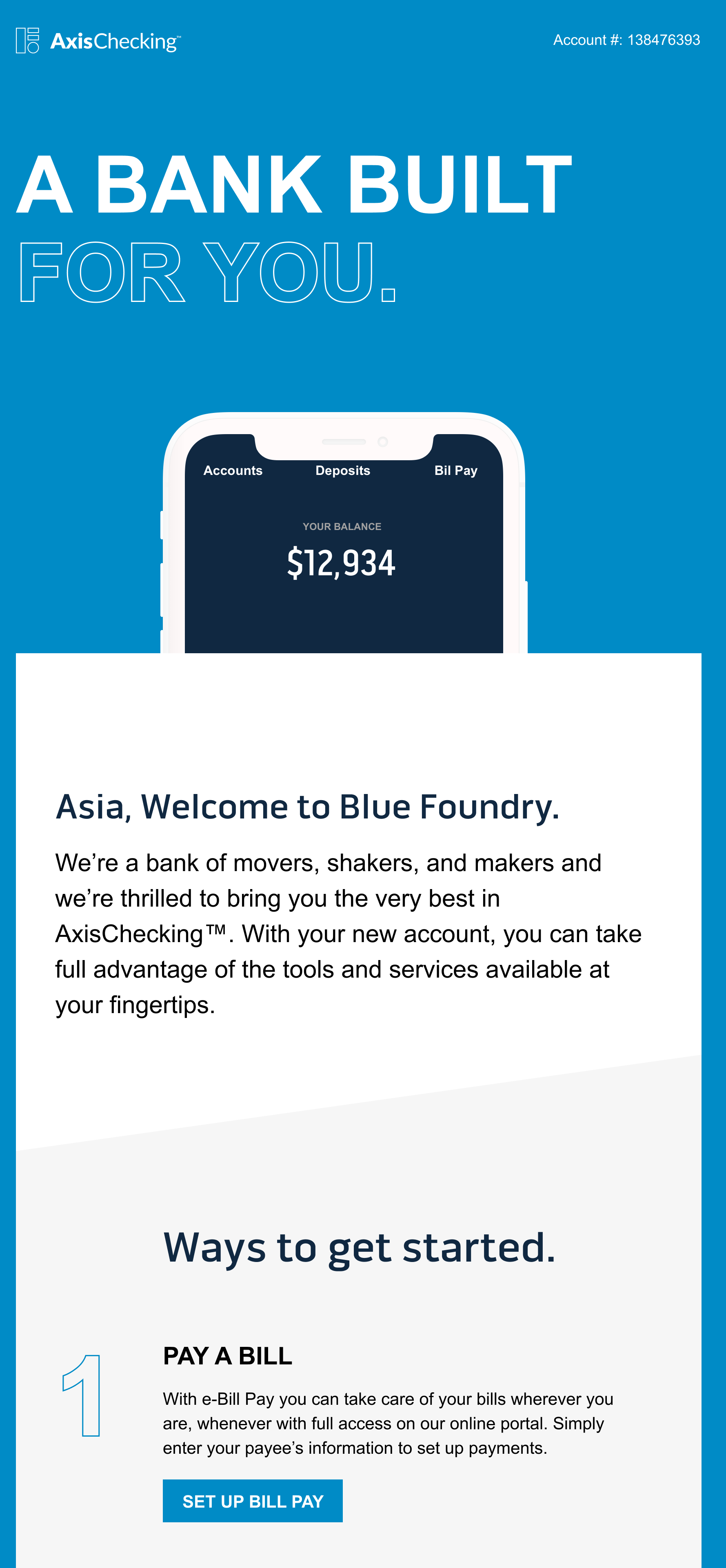
designs are responsive and client-friendly. In this email series, there are three emails: Welcome Email,
Digital Banking Email, and Promotions Email. The goal of the first email is to get users to take
advantage of e-banking features. To do this, we give the customer actionable items to complete,
clearly organized in a numbered list. Each call-to-action is deeplinked to an external page while
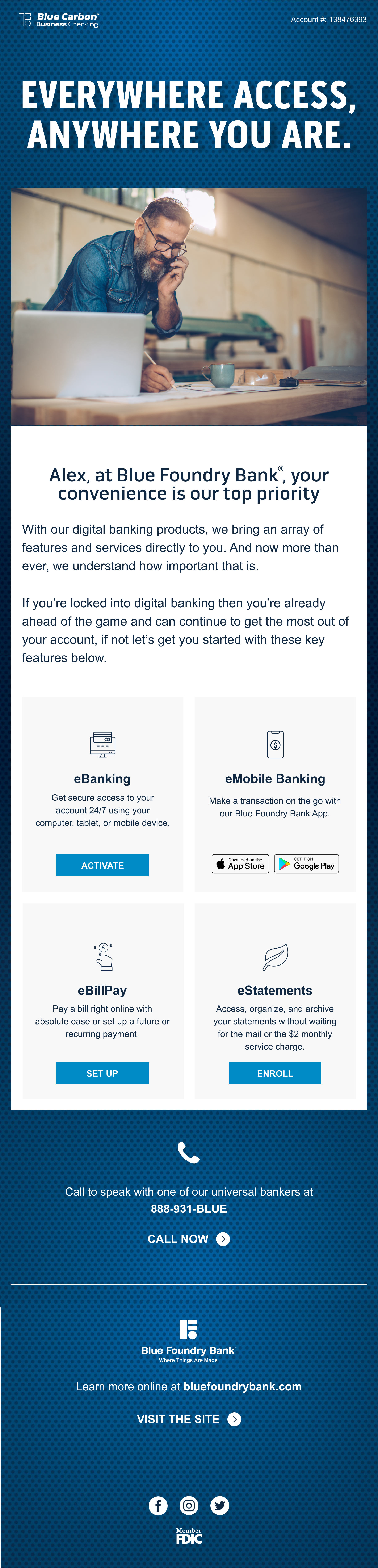
secondary items are listed but not linked. The Digital Banking Email serves to enforce digital banking features in a different way through
a new layout and iconography. Finally, the promotions email focuses on quarterly promotions by
introducing familiar brands and actionable steps to activate these promotions.
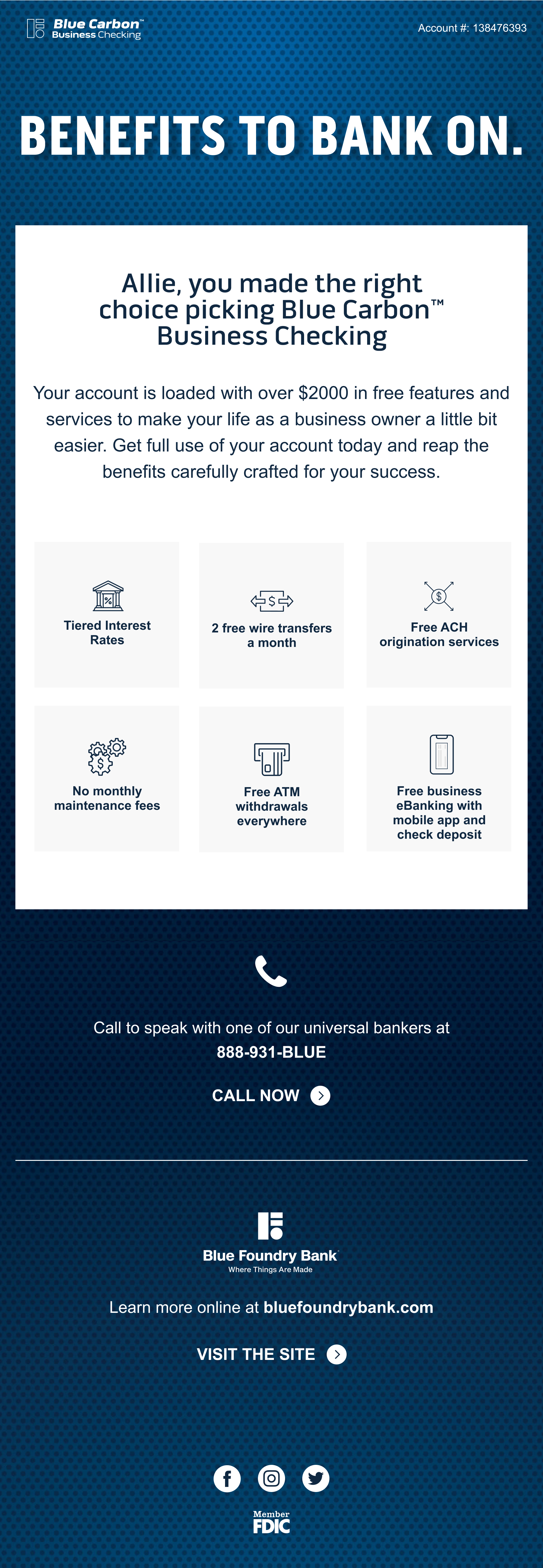
Our goal in designing this email series was to create a resuable email flow and design system
that can be applied to each sub-brand. Blue Carbon Banking targets business owners which we considered
in the images, copy, and branding system, while keeping the information content and hierarchy the same across sub-brands.
The intention behind each email remains the same across sub-brands with the exception of the third email
which focuses on additional features and benefits rather than promotions.
I found this project really interesting, especially learning about a new industry. Looking back, I think
that my research wasn't as transferrable to the final implementation as I would have liked.
My favorite aspect of the project was creating the justomer map and thinking about how the customer
will interact with the email at each stage of the onboarding experience. Thinking critically about
this experience at a high-level was instrumental in understanding the customer and creating the template designs.
This website was created by Chloe Kanders, Copyright 2020.